
This page builds on 'Words Fail, Send Love' and 'Vector's Fall to Word' to further explore the challenges of sharing information encoded in high-dimensional vector spaces. It shows different ways to represent vectors visually and describes the difficulties in decoding or interpreting the information. This plays on the idea that for humans, art might be a way to communicate in high-dimensional vector spaces, with dimensions including emotions, cultural context, and personal experiences.
Created in Python using Digits Dataset, Matplotlib, Seaborn and UMAP.
Principal Component Analysis
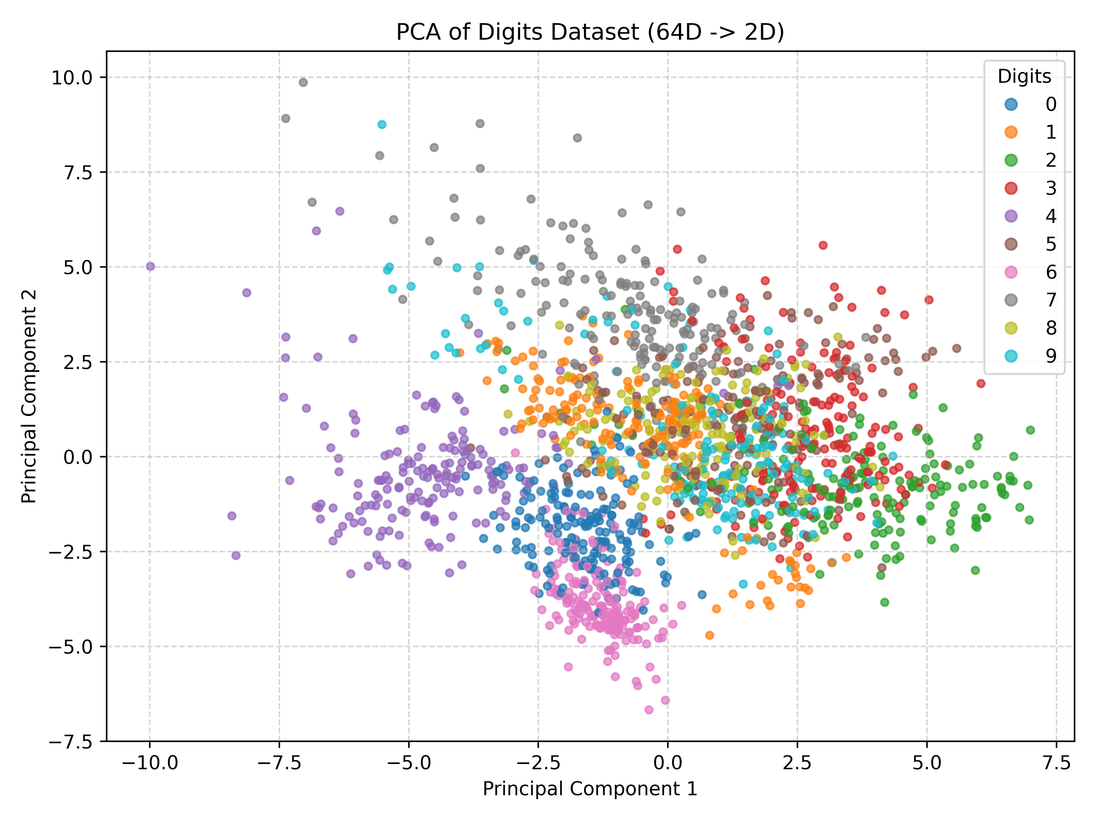
Principal Component Analysis (PCA) is a linear technique that reduces dimensionality by identifying the directions of maximum variance, called principal components. It is often used for visualizing data by plotting it along the first few components and is known for being simple, fast, and preserving global data structure. However, because PCA is linear, it may struggle to capture complex non-linear relationships and can cause clusters to overlap if they aren't separated along the main variance axes.
t-distributed Stochastic Neighbor Embedding
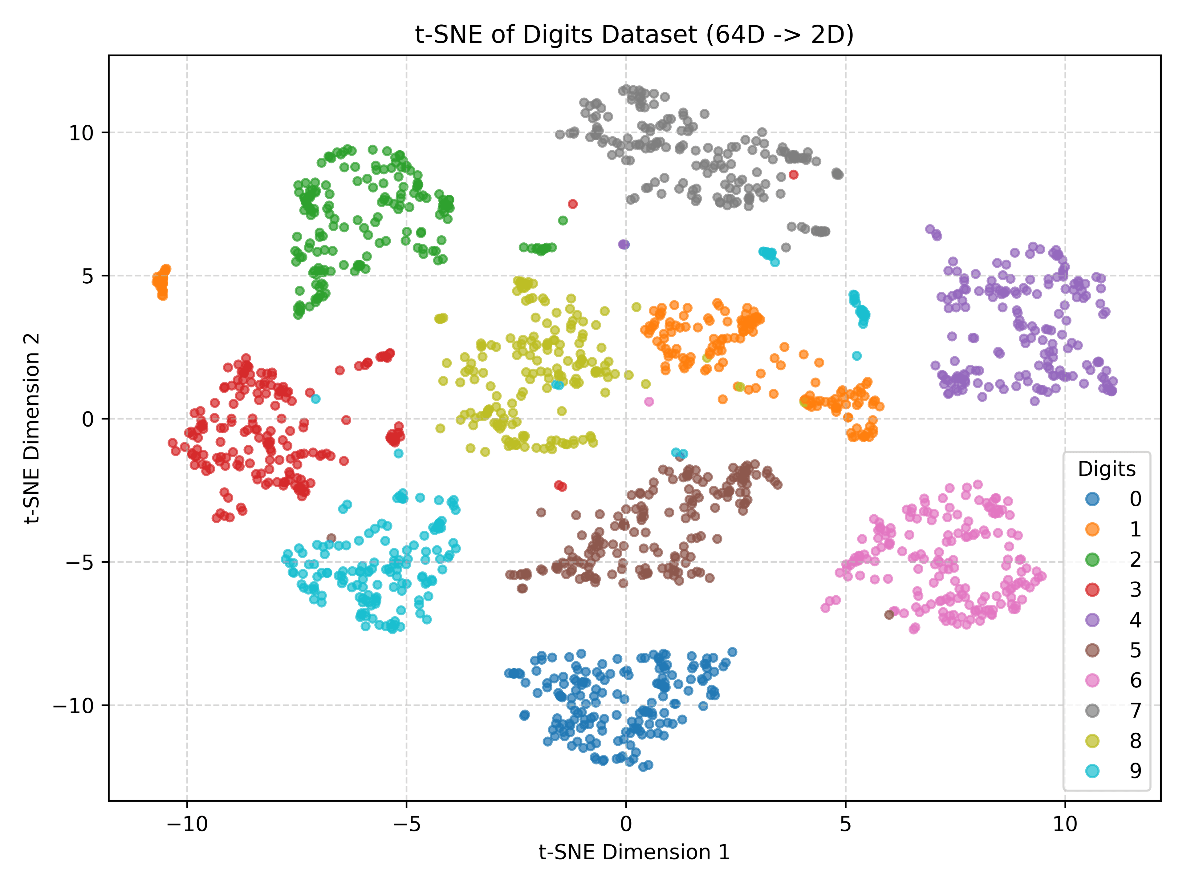
t-SNE is a popular non-linear technique designed for visualizing high-dimensional data by preserving its local structure in a lower-dimensional map, typically 2D. It focuses on ensuring that points close together in the original space remain close in the visualization, making it excellent for revealing clusters. However, t-SNE is computationally intensive, the resulting distances between clusters might not be meaningful, and its output can vary significantly with parameter choices, limiting its use primarily to visualization.
Multidimensional Scaling
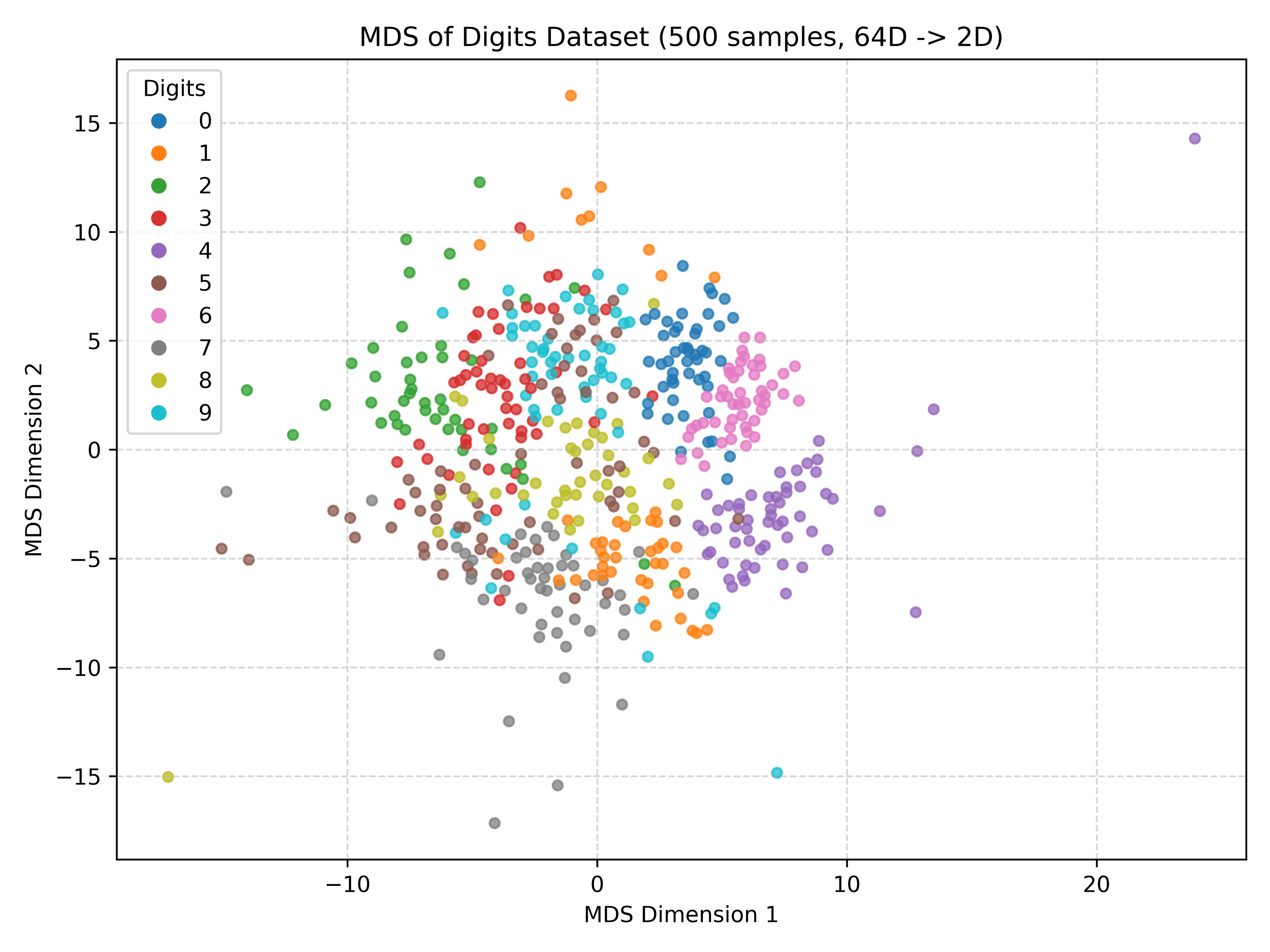
Multidimensional Scaling (MDS) is a group of techniques used to map high-dimensional data into a lower-dimensional space. Its primary goal is to arrange the points in the low-dimensional space so that the distances between them accurately reflect the distances or dissimilarities in the original data. While MDS directly focuses on preserving these pairwise distances, it can be computationally expensive and comes in different variants like classical, metric, and non-metric.
Uniform Manifold Approximation and Projection
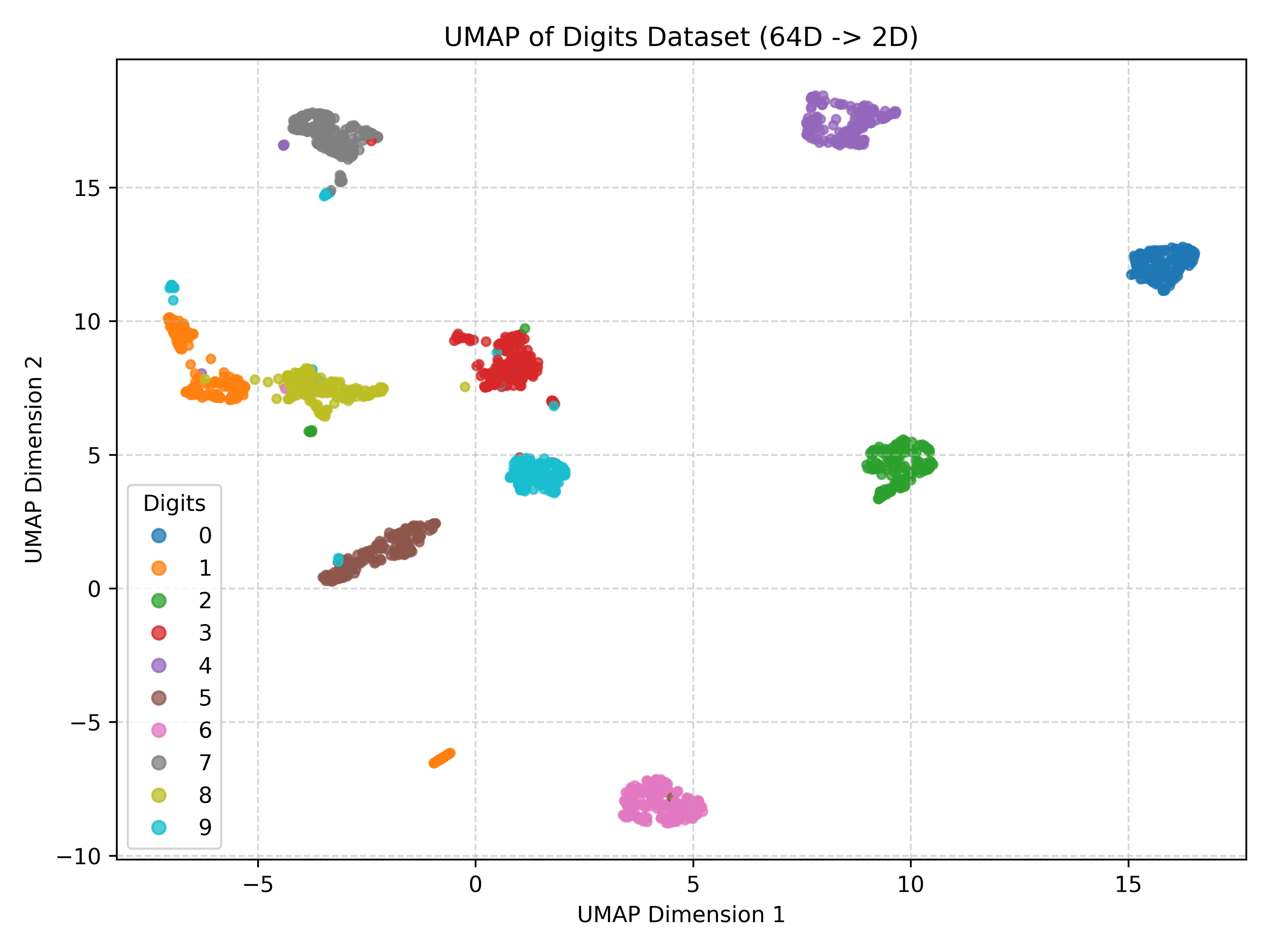
UMAP is a newer, non-linear technique for dimensionality reduction and visualization that effectively captures local data structure, similar to t-SNE. It often outperforms t-SNE by being faster and providing a better balance between preserving local details and some global structure. However, UMAP's results can be sensitive to parameter settings and require careful interpretation.
Scatter Plot Matrix
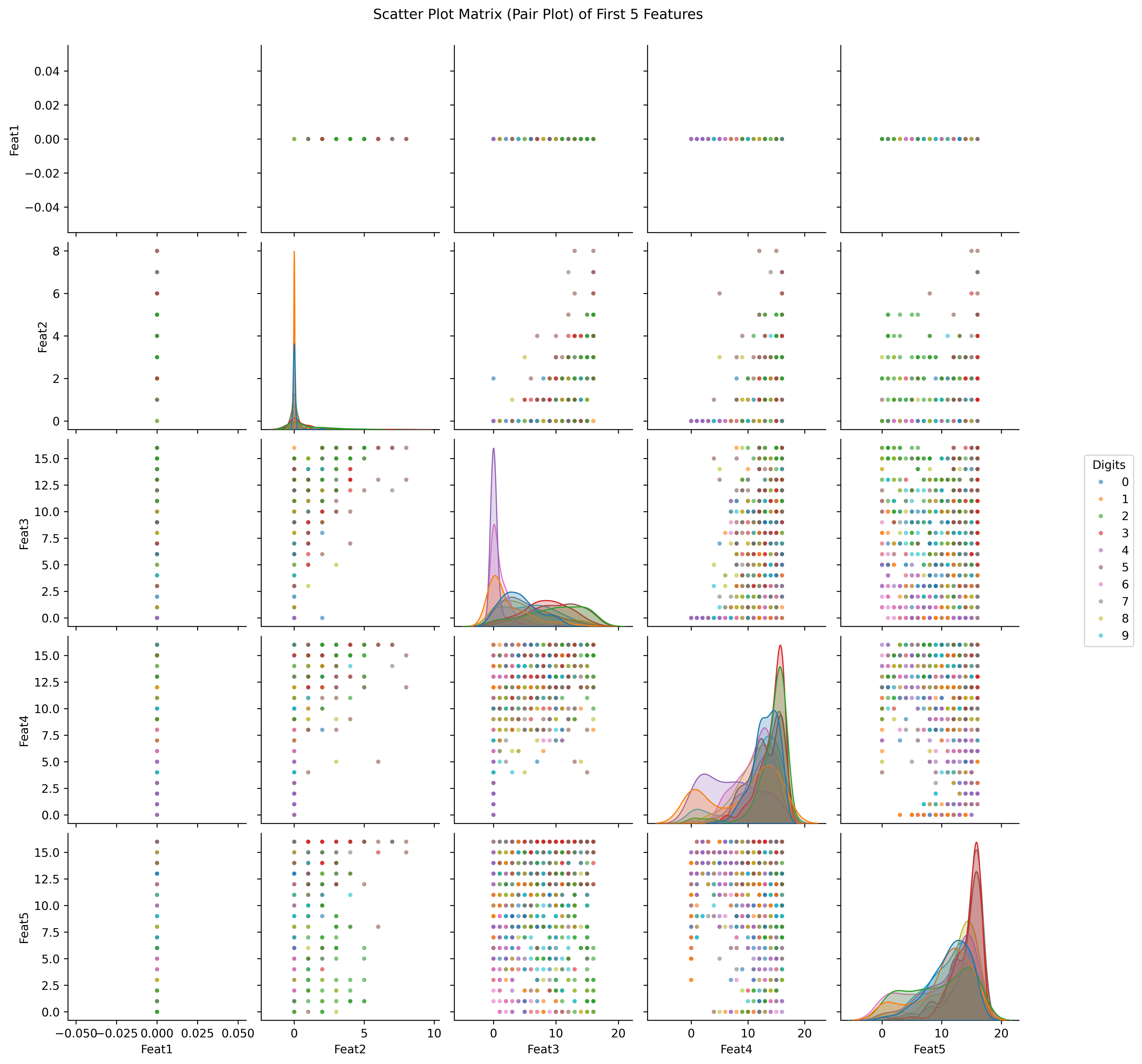
A Scatter Plot Matrix (SPLOM) is a visualization tool that arranges scatter plots in a grid to show the relationship between every pair of dimensions in a dataset. This method allows for the direct comparison of all pairwise variable interactions, often including histograms or density plots on the diagonal for individual dimensions. However, SPLOMs quickly become unwieldy as the number of dimensions grows and cannot illustrate relationships involving more than two dimensions simultaneously.
Parallel Coordinates Plot
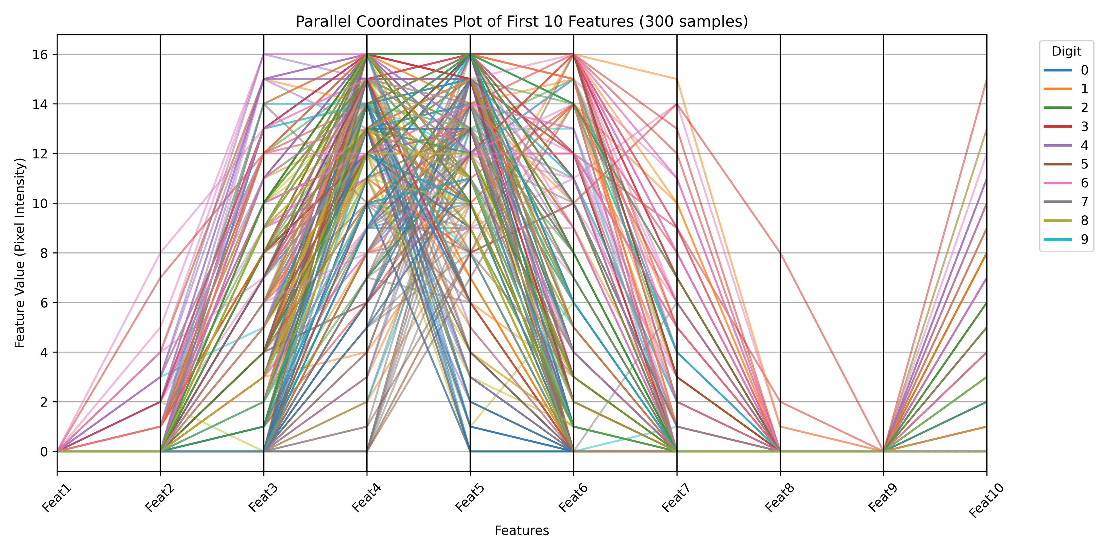
A Parallel Coordinates Plot visualizes high-dimensional data by assigning a parallel vertical axis to each dimension and representing each data point as a line connecting its values across these axes. This method allows for displaying many dimensions at once, and patterns in the lines can indicate clusters or correlations. However, the plot can become cluttered with numerous data points, the visual patterns heavily depend on the axis order, and it can be difficult to discern the structure of individual points.
Heatmap
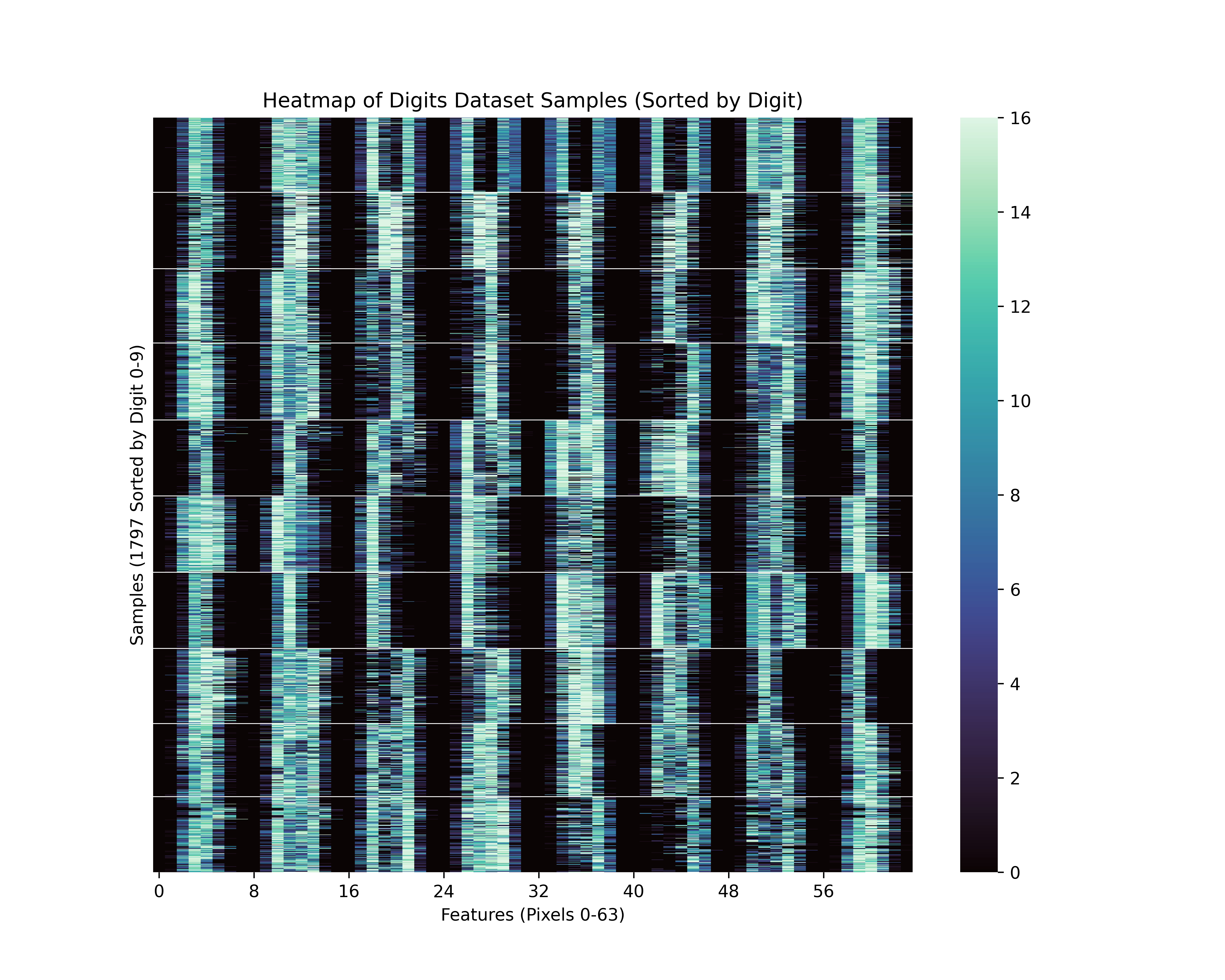
Heatmaps visualize matrices, such as distance or correlation matrices derived from data vectors, by representing values with color intensity. They are often combined with hierarchical clustering to reorder rows and columns, which helps reveal patterns and structures within the data. While effective for visualizing matrix patterns and scaling visually, heatmaps represent the matrix itself rather than the direct spatial positions of the original data points.